Rebranding and Platform Design
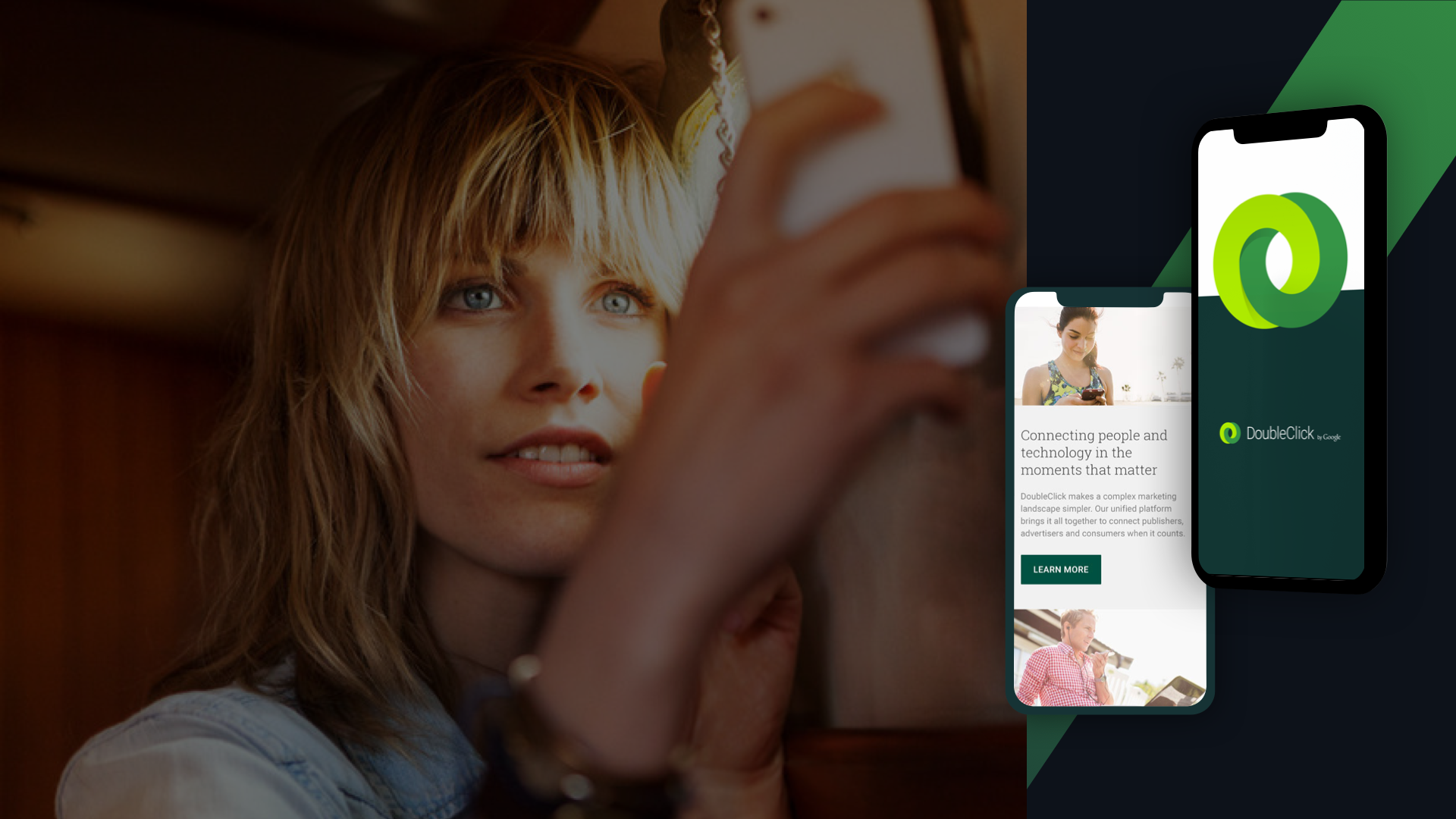
DoubleClick by Google
DATE:
CLIENT:
Webflow
INFO:
Location: Askania Nova
OVERVIEW
DoubleClick is a subsidiary of Google which develops and provides Internet ad serving services. It is one of Google's biggest revenue making products. As the creative lead, I oversaw the rebranding, platform experience design and led the product team for the following couple of years to update the product and and create new experiences.
THE CHALLENGE
A meaningful experience that instigates powerful connections
DoubleClick needed to redesign their brand and develop a new digital presence that inspired advertisers and publishers about the power of programmatic technology.

THE PROCESS
1. Redefining brand Identity and strategy
DoubleClick as a brand and a company is a connector — bringing the publishing and advertising sides of the industry together. As such, the logo became a manifestation of that connection, showing two, fluid interlocking rings. This fluidity and connectivity became the central design technique that ran through the entire brand and web identity.
A scalable visual system
Once the new logo mark and icon system were established, I led the creative process of building a new set of brand guidelines including color palette, typography, iconography, photography and illustration to create a cohesive brand story.

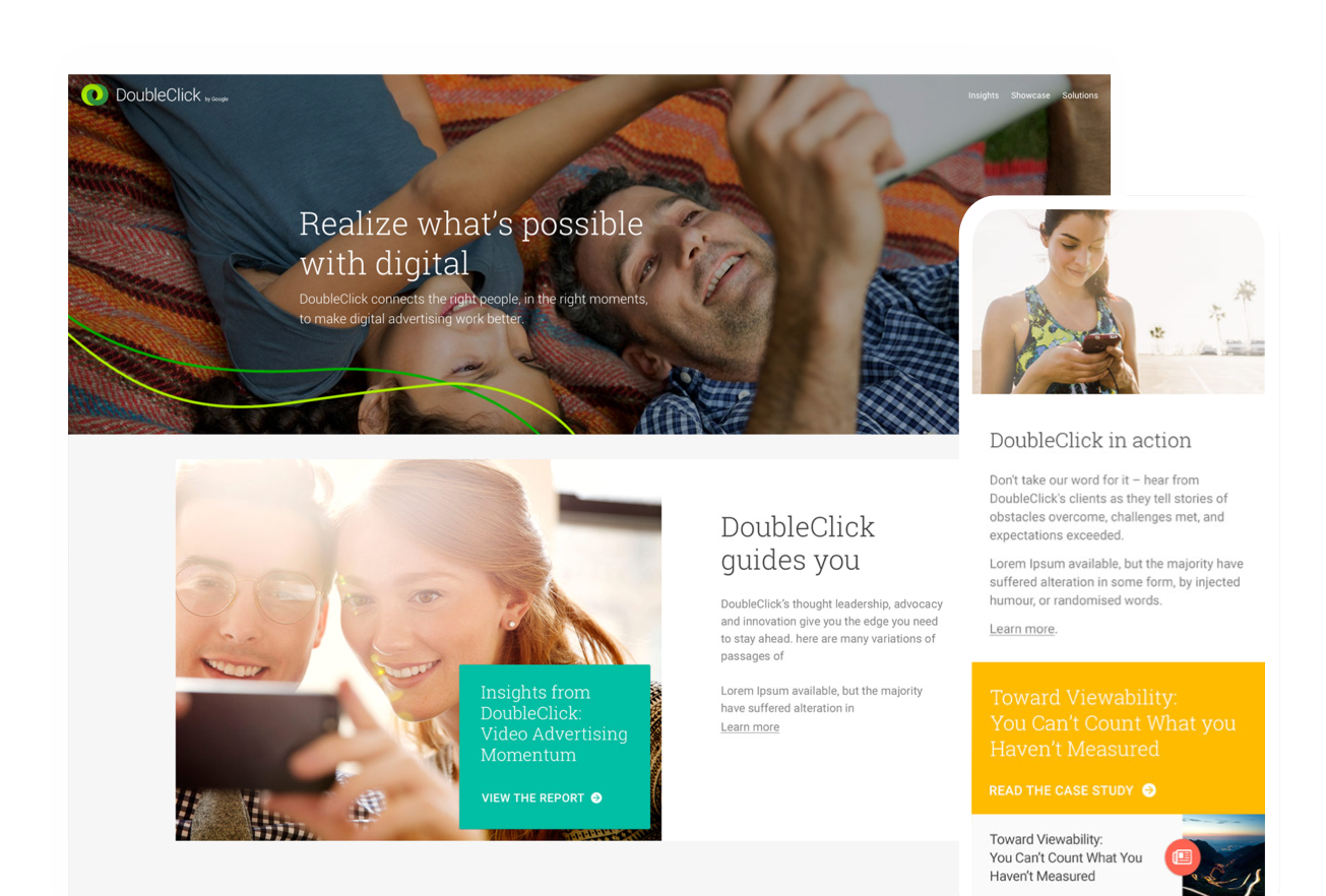
2. Humanizing the digital experience
The goal was to achieve a highly visual, immersive website with content at its core.
The overall direction of the site was very human focused to balance the heavy technology and automation of the product offering.
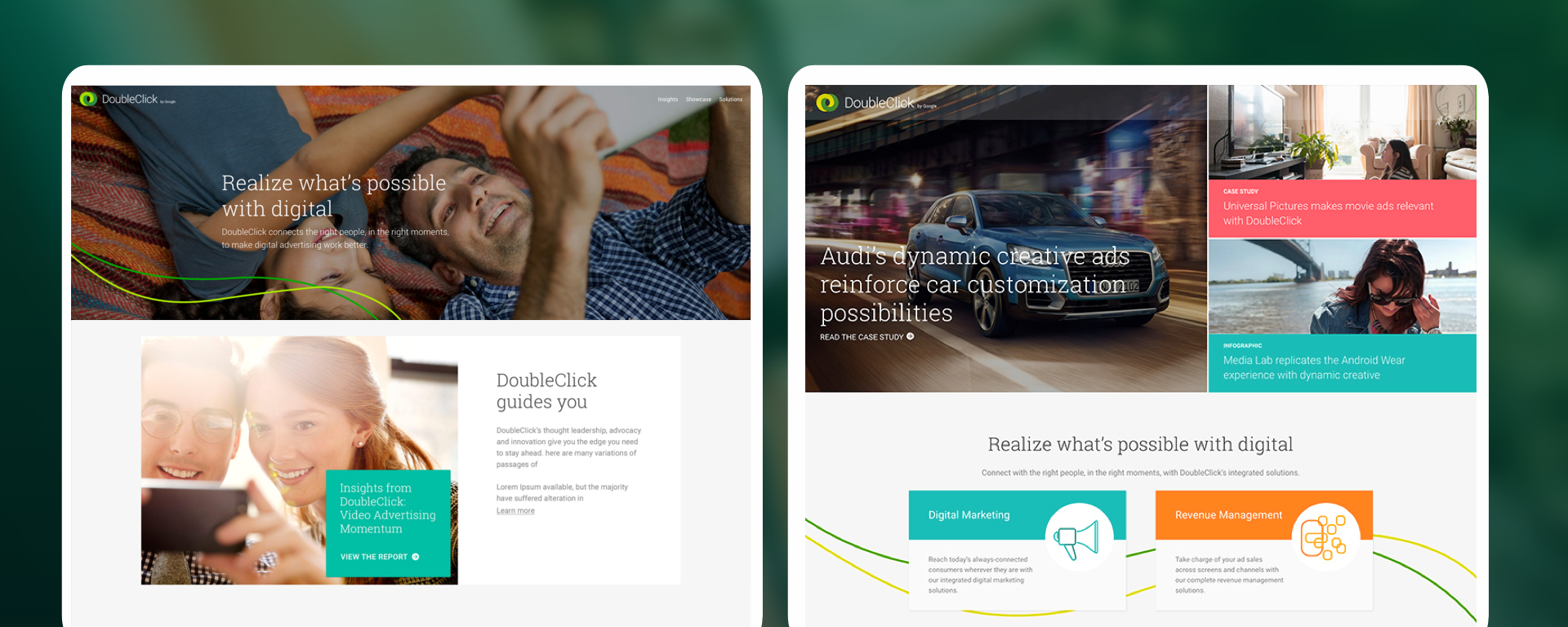
3. Creating a dynamic and fluid experience
1. Information architecture was simplified to prioritize consumer needs and benefits over products
2. A modular system was built to enable an easily scalable product
Whiteboard sessions and low fidelity wireframes

Information architecture and high fidelity wireframes

THE OUTCOME
A new content ecosystem that best represented DoubleClick’s new human-focussed brand identity – packaged within a modern, responsive platform


Post Launch and Analytics Findings
1. Visitors want to be inspired and learn
Highest traffic to showcases and insights
2. Visitors want product related content
High traffic to programmatic, digital marketing, revenue management
3. Current content strategy works but a deeper engagement is desired
We need to get users to article pages as quickly as possible
A/B Testing and design updates that lead to success
To respond user needs, we created a more dynamic content based homepage and directed 50% of the users to the new version of the site. Analytics showed immediate traffic increase.


ATOMIC DESIGN
Building a design system that scales
We worked on creating and maintaining a robust design system, for more consistent UI patterns focusing on effective hierarchies and design patterns enabling an efficient workflow for the product team.


Product team and ongoing iterations
The team continuously evolved the existing patterns and added new elements and created micro experiences to enhance the overall brand interactions.
1. Changing existing design patterns

2. Adding new content types and micro-sites
